Cleaning data can mean many things: OCRing, removing capitalization, eliminating extra spaces, etc. It can also mean something less sophisticated: taking an image with text and turning it into a csv file (or some other spatially-usable form). As a group, our digital humanities class made a new history of the Albuquerque Sunport. My friend Gary and I decided to address the relative rates of travel to and from Albuquerque. After all, we often take airports for granted without really realizing just how much closer they bring the rest of the world.
I've always been fascinated by a wonderful map depicting rates of travel from New York in 1857.

I began to wonder if I could somehow duplicate this effect within the framework of the Sunport project. I wouldn't have been able to even attempt such a thing without stacks of raw timetable data. Lucky for me, there's a magical place called Timetable Images. The site has hordes of digitized timetables from old airlines; I chose to focus on Continental and TWA, the earliest major airlines to serve Albuquerque's municipal airport (to my knowledge). As an added bonus, each carrier represented a vastly different vision of the nation's air travel. TWA treated Albuquerque like a halfway point between New York and Los Angeles, a cog in a much larger system. Continental, however, served a very narrowly defined section of the southwestern U.S. As a result, its destinations were much closer--temporally, spatially, culturally-- to Albuquerque.
The first challenge? To transform a flight table into usable data.

There's a lot of added noise in a flight table: time zones, transfers, and--most importantly--symbols denoting meal service. First off, I had to decide what to do about transfers. Granted, including them in my calculations would increase the overall scope of my data (and greatly expand the reach of each airline-- both Continental and TWA used other carriers to reach areas like Boston and San Francisco. I decided to ignore these extra permutations, given the time allowed and desired scope--after all, sections of certain flight tables looked like this:

Even though I made an initial decision to cut down on my detective work, I still had to dissect fourteen separate flight tables--two airlines with seven distinct intervals (every five years from 1935 to 1965). In ignoring connecting flights, I left myself with a much cleaner set of parameters: flights to/from Albuquerque without any plane changes or transfers. That way, I could not only chart distance but also Albuquerque's relative isolation--travelers could get almost anywhere if they transferred, but direct flights offered a clearer view of what was possible for the average traveler (who didn't want to spend 20 hours getting to New York).
So, my task was relative simple: see flight table. Find travel times on direct flights to and from Albuquerque. Calculate time zones correctly. What other data did I need? Well, since I was planning on putting my findings into QGIS, I needed lat/long for each outlying destination. There are quick and easy ways to do this, but they aren't described here. I also noted that most of the time tables had one-way prices, so I included those in case they'd come in handy later. My flight tables all looked something like this:

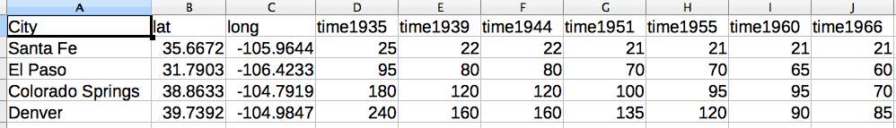
The above table is for Continental (1935); it's the simplest one of all. I made tables for each airline (and each year), so I ended up with fourteen different csv files. This was a good start, but such fine-grained data wasn't really going to help me aggregate and display my findings. Since my ultimate goal was displaying the changes in flight times from 1935-1965, I decided to compile all seven of each airline's csv files in singular tables.

You'll notice there are a lot of holes in the table (aside from Santa Fe/El Paso/Colorado Springs/ Denver. As new flights were added each year, new cities and flight times popped up on my radar. The trends are pretty intuitive: with each passing year, Albuquerqueans could fly directly to more places nationwide. However, for my goal of showing cumulative flight time changes between 1935 and 1965, only cities with complete data sets would do. Below you'll see the final table for Continental Airlines, ready for QGIS:
Cleaning data is not always efficient. From the get-go, I knew I'd rather have too much data than not enough. So, I looked through census figures to get accurate population figures for each city involved (only on census years in my range: 1940, 1950, 1960). While this didn't fit my stated goal of change in time over time, population data can never really hurt. I've only mapped the cumulative 1935-1965 data sets, so at a later point-- when I can start unpacking my data on a more granular scale--the census info might come in handy. For now, though, it's a little bit too cacophonous.
I've also yet to figure out a way to incorporate flight pricing. While it may be of interest at a smaller level (say, price of flying to New York over time), the combined data sets don't offer an ideal window through which to display flight pricing. Additionally, monetary values carry the added burden of contextualization: value is never constant, so wage scales and inflation become almost necessary to interpret the cost of flying. My goal, on the other hand, was to see the temporal impact of airplane flight on the lives of Albuquerque's citizens. What was close? What was distant? How did it shape their conception of nation and region?